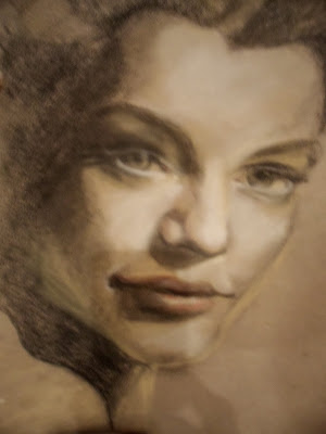
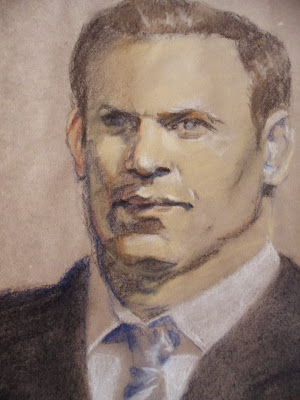
Sunday, 19 February 2012

Thinking of Summer

This dandelion close-up was one I painted last year, and I've only just realized that I hadn't posted it!

As I worked at it, it became an interesting study in backgrounds, as much of the canvas is blurred and in shadow. It is something of a fascination to me to examine how the great painters treated the things they don't want you to notice-- some, like Rembrandt or Bouguereau, creating heavy, near-black expanses for backdrops; others, like Norman Rockwell, bleaching out the still in-focus side items.

With this particular background, I tried to imitate what a person sees with the normal eye. Just look at your own hand while it's about six inches from your face. While looking at the details of your hand, notice what is happening beyond your hand. If your sight is like mine, you'll see general shapes and colours, in sort of a foggy blur.

It was that sense of immediacy I wanted to create with this background-- that feeling that you are looking at the dandelion, but all around you is the grass and evening sunshine; a feeling that this kind of beauty is happening all around you, begging to be noticed.

20 x 24" acrylic on canvas

Thursday, 12 January 2012

Puddle Ducks

I recently painted these ducks for a friend's baby room. It's an acrylic wash with pen and ink, framed under glass in a vintage, scraped up, cream-coloured frame.

original sold

Thursday, 24 November 2011

Merry Christmas!

To get ready for a Christmas sale, I've been doing a series of cards. Each festive little piece is a pen and ink drawing --with hits of gold paint and red watercolour-- done on 140 lb. watercolour paper, and mounted on standard size, quarter fold cardstock. 

I played around with cheery, simple images, tucking Art Deco embellishments here and there.

Enjoy! And have a wonderful Christmas season.


originals sold

originals sold

originals sold


Thursday, 3 November 2011

Amid our Autumn

I would like to share with you a quick sketch I did this fall.

It was a sunny-crisp Saturday just after Thanksgiving. The leaves were a riot of colour, the sun igniting their blazing hues. I sat on the sand and got out my watercolours, enjoying the shapes of bridge and buildings and valley.

For me, that moment was a sigh in my busy autumn, and this picture reminds me of the peace and pure enjoyment of that special Saturday trip to the park.

Thursday, 20 October 2011

Roaring Bear

I've been having a ton of fun with a quirky project a friend asked me to tackle! "Could you please paint a roaring bear on my guitar?" he asked, and then left it at that.

What a great assignment!

I played around with a few ideas, and got several books out of the library (real bedtime literature, with titles like "Bear Attacks" and "Bear Survival" --full of gory tales of camping trips gone wrong... and of course when my eye would catch a word like "severed" or "crazed" there was no way I could keep myself from reading the rest of the page).

Finally, I decided to use as inspiration the picture from the front of a magazine: perfect profile, great lighting, amazingly wide jaws--just what I had been hoping to find!


Jordan had already sanded down his guitar, so after painting the bear, I finished the whole guitar with a water-based, matte varathane (he explained that super-shiny finishes on guitars are a thing of the past --think of the blindingly glossy guitars of the 1990s).

And here's the finished product!


Tuesday, 19 July 2011

Art Walk Success!

Thank you to everyone who stopped by my show at Art Walk this past weekend! Your support means more than I can say.
The weather was great--which isn't a given this summer-- and people absolutely poured past each day. With the sweltering afternoons, my location by the Marble Slab turned out to be gold; there was a steady line in and out of the shop, which gave people time to stop and look at my work.
I met some great art enthusiasts, encouragers and gallery owners. While exhausting, the three-day marathon turned out to be a great opportunity to meet people and sell art.
Thank you to all of you who bought a painting!


Tuesday, 21 June 2011

Number 25

I've been thinking a lot about underpainting.
The Old Masters would paint in monochromatic tones beneath their paintings, and then build them up with layer upon layer of washes, carefully mixed with egg to allow them to have just the right translucence to let the richness of the underpainting show through. Then, along came other schools of thought-- like Van Gogh, who would dash paint onto the canvas in the heat of the day, breaking rules left and right, using paint right out of the tube, portraying the sun as a round orange in the middle of the sky. His underpainting was nothing more than a quick outline in black.
Maybe what got me thinking about this was a workshop I took this winter... the course instructor taught about painting "hot" colours beneath the light sources. Like how a blue sky (blue is a shady, "cool" colour) is actually, when you look out your window, the brightest part of the view. So how do you make your canvas "read" like real life? Her solution: paint pink (a warm colour) beneath. Underpainting.
I've been honing this a bit, trying to use her wisdom without stealing her style. 
So when you look at this cow number 25, I thought you might be interested to hear about the underneath layers... the purples beneath the red of her coat, the blue in the eyes. 

sold

18x18" acrylic on canvas